
BRAND GUIDELINES
Visual Identity Standards
01. Color Palette 03
02. Typography 04
03. Logo Usage 05
04. UI Components 06
05. Teen Visual Identity 07
06. Hero Image Composition 09
About This Guide
This brand guide establishes the visual identity standards for The Redpoint Center.
Consistent application of these guidelines ensures a cohesive brand experience across
all touchpoints, reinforcing trust and recognition with our audience.
The Redpoint Center
Compassionate Care for Recovery
Regular Weight
400
Bold Weight
700
Medium weight for emphasis
Light weight is used for body text and longer paragraphs. The generous letter-spacing
and light weight create an elegant, approachable reading experience that reflects
our commitment to compassionate care.
Light Weight
300
Medium Weight
500
Type Scale
H1 / 48px Headlines
H2 / 36px Section Titles
H3 / 28px Subsections
H4 / 22px Card Titles
Body / 16px Body text for paragraphs and content
Small / 14px Captions, labels, and secondary text
Color Emphasis
Main Brand
- 60% -Redpoint Blue
#243855 - 25% -White / Light
- 10% -Teal accents
- 5% -Red CTAs
Blue-dominant · Formal · Authoritative
Teen Brand
- 60% -Redpoint Teal
#9fd2ca - 25% -Redpoint Blue (cards, text)
- 10% -White
- 5% -Red CTAs
Teal-dominant · Warm · Approachable
The Teen identity uses the same five brand colors but inverts the hierarchy. Teal becomes the dominant background and overlay color, while blue is used for cards, headings, and text. This creates a warmer, more inviting feel while remaining unmistakably Redpoint.
Typography -Caveat
Journey Through Adolescence
Teen Mental Health
A handwritten-style variable font that brings warmth, energy, and a personal touch
to teen-facing content. Used in place of Trajan Pro for all Teen page headings.
Regular Weight
400
Bold Weight
700
Teen Font Mapping
Usage
Main Brand
Teen Brand
Headlines
Trajan Pro
Caveat Bold
Body Text
Avenir Light
Avenir Light (same)
Hero Watermark
Cinzel Bold
Cinzel Bold (same)
Teen UI Components
Supporting Healthy Growth
Our professionals provide therapy focusing on traditional modalities, problem-solving, coaching, and mentorship.
Community
IOP participants meet peers and sponsors who are going through similar struggles and journeys.
Teen vs. Main -Key Differences
Element
Main Brand
Teen Brand
Buttons
Square corners
Fully rounded (pill shape)
Cards
Square or subtle rounding
16px border-radius
Images
Square or bordered frames
16px border-radius
Hero Overlay
Blue (#243855) at 60%
Teal (#9fd2ca) at 60%
"R." Color
White
Teal (#9fd2ca)
Headline Font
Trajan Pro (serif)
Caveat (handwritten)
Layer Structure
The hero image is not a pre-rendered composite. The "R." watermark is rendered live and blended with the background using an overlay effect. This allows any scenic image to be swapped in without re-exporting assets.
Z-3 · Top
"R." Watermark + Page Content
Cinzel Bold · Overlay blend · Responsive 300px-700px
Z-2
Gradient Fade
Vertical gradient · Transparent → Brand color at bottom edge
Z-1
Color Overlay
Solid brand color at 60% opacity · Tints the image
Z-0 · Base
Scenic Background Image
Mountain/nature photography · Full-cover · Top-aligned
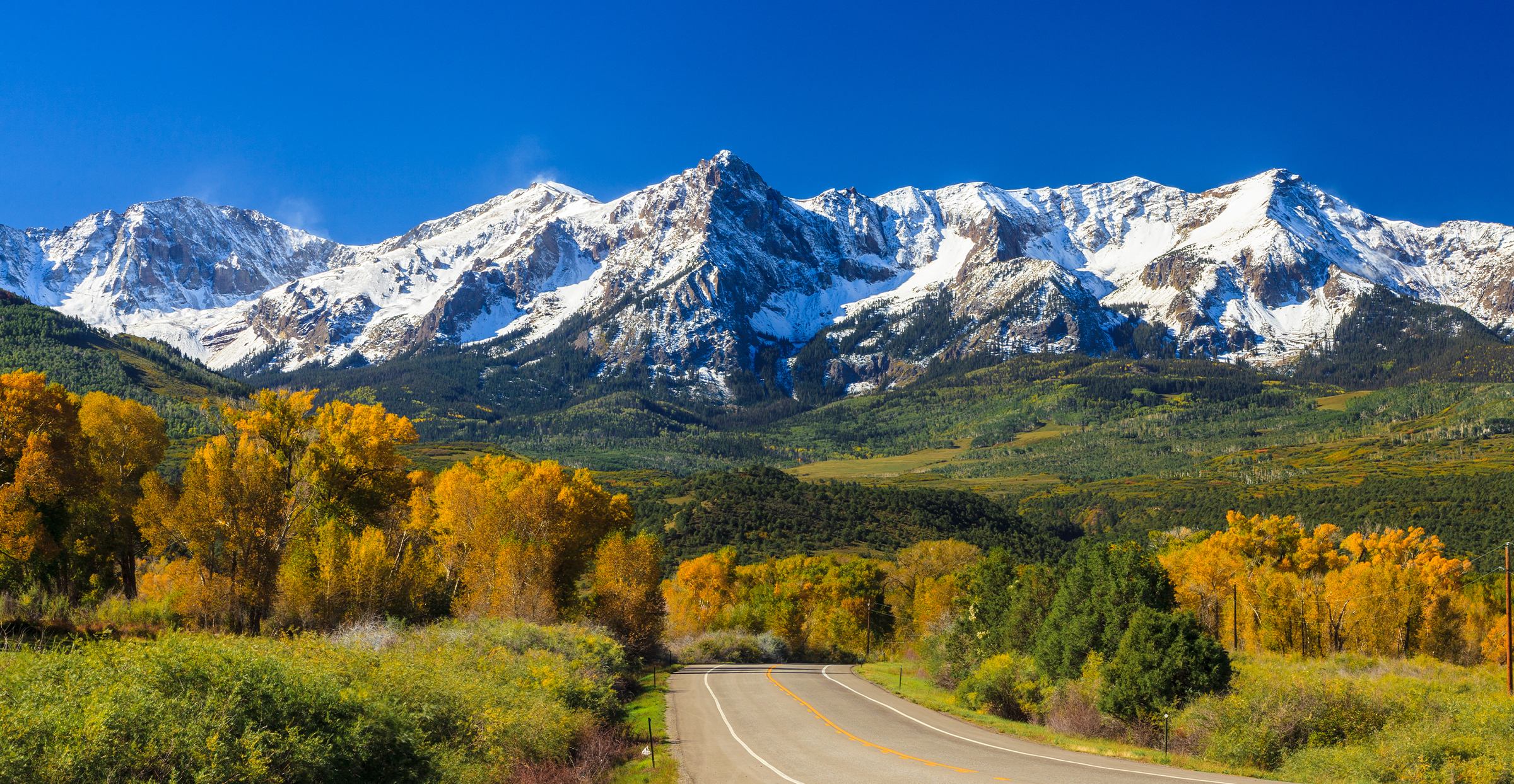
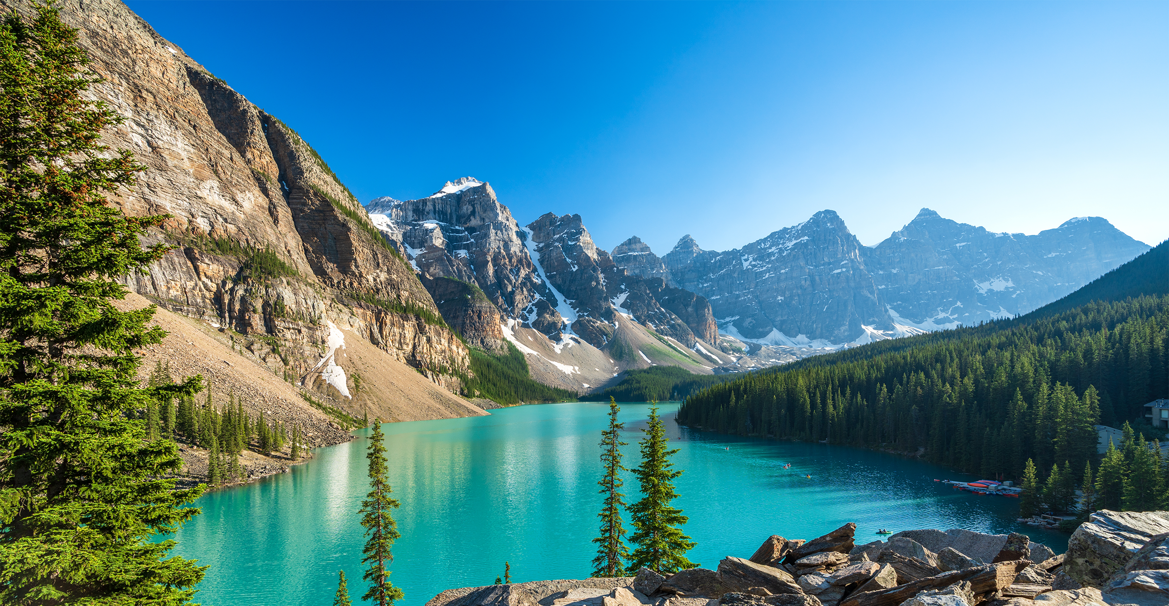
Hero Image Rotation
Three hero images rotate randomly on each page load (no consecutive repeats). Below is how each image renders with the full overlay composition applied.
"R." Watermark Specifications
Typography
- Font: Cinzel Bold
- Character: R. (period is ~70% of R size)
- Blend: Overlay
- Line Height: 1 (tight)
Responsive Scale
- Mobile: 300px
- Tablet (md): 400px
- Desktop (lg): 500px
- Large (2xl): 625px
- 4K (4xl): 700px
Color Variants
Main Brand Hero
- "R." Color: White
- Overlay: Brand Blue at 60% opacity
- Gradient: Fades to Brand Blue (#243855)
- Background: Brand Blue (#243855)
Teen Brand Hero
- "R." Color: Teal (#9fd2ca)
- Overlay: Teal at 60% opacity
- Gradient: Fades to Teal (#9fd2ca)
- Background: Teal (#9fd2ca)
Background Image Guidelines
Image Requirements
- Format: WebP preferred, PNG fallback
- Dimensions: 2400 × 1244px minimum
- Content: Mountain scenery, nature, landscapes
- Position: Top-aligned
Responsive Breakpoints
- Mobile: Background image hidden (<640px)
- Tablet (sm): 768px variant
- Desktop (md): 1024px variant
- Large (lg): 1400px+ full resolution
 Primary -Light Backgrounds
  Alternate -Red Variant
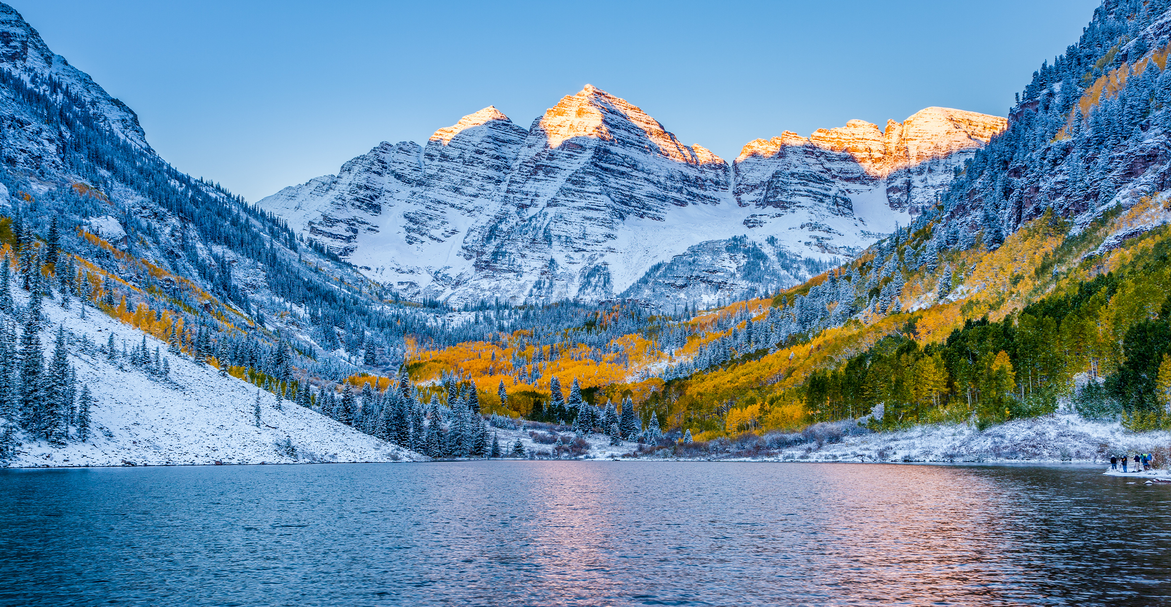